
My Color Scanner Had a Hidden Setting… and It Changed Everything
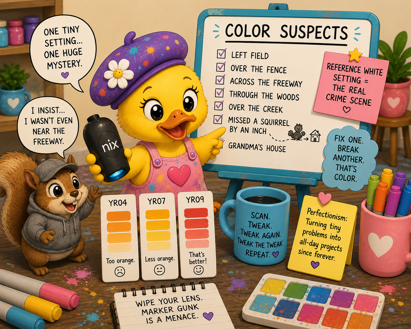
🐥 A quick note: Yes, the silly Painter Duck illustrations in this post were created with AI. They’re here to make you smile. I use AI as one of many creative tools, alongside my paintbrushes, colored pencils, and whatever tiny setting just hijacked my afternoon.
So. Let me tell you about the afternoon a tiny little setting completely changed how I use my color scanner.
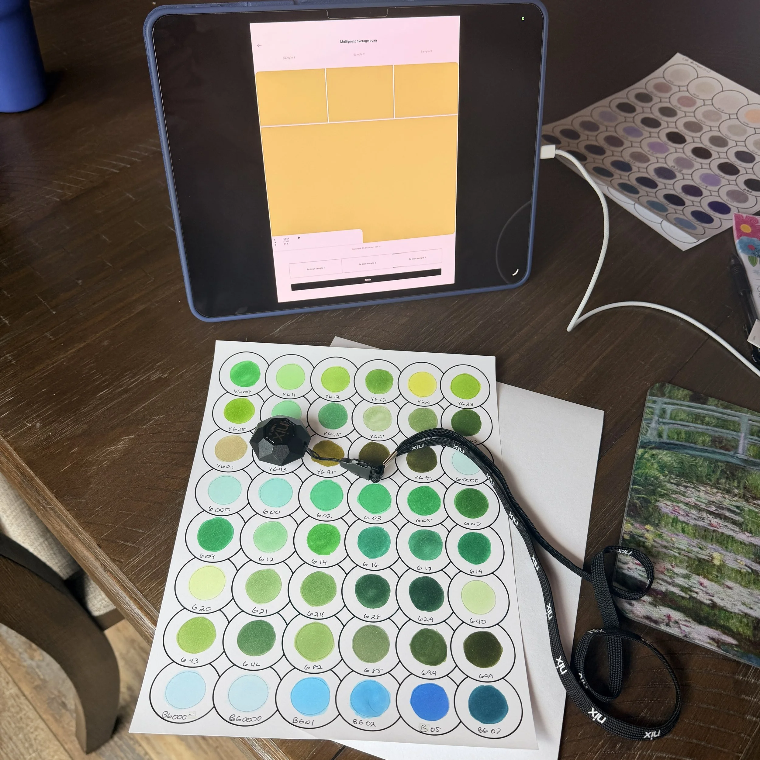
I’ve got this color scanner, a Nix, that’s supposed to read a real marker or pencil and hand me the exact color, like a little magic eyedropper for the physical world. I use it to calibrate the DS Color Atlas so the matches line up with the actual supplies sitting in my hand. Beautiful. Perfect. In theory.
At first, I thought it was amazing. I sat down and started scanning swatches, and one after another they were coming in surprisingly close. I thought, This thing is fantastic.
Then I got to my YRs.
They weren’t horribly wrong. They were just… warmer than what I was actually looking at. Enough that my brain kept saying, No… that’s not quite it.
Most people probably would’ve looked at it and thought, Close enough.
I’m building a color reference tool. “Close enough” is where I usually start.
So I kept doing what I’d been doing all along. I’d scan my three swatches. If one leaned too orange, I’d simply move the Nix over to another swatch that already leaned a little more blue or a little more red. I’d keep working my way toward the color I was actually seeing.
It worked. I figured that was just how you used the scanner.
Then I stumbled across a setting called Reference White. I’d seen it before, but I had absolutely no idea what “Reference White” or “Illuminant” meant. Those sounded like words invented specifically to make me close the settings menu. Out of curiosity, I started clicking through the different settings, and the colors changed enough that I finally stopped and asked Claude what the heck this thing actually did.
Once I understood what it was doing, everything made a lot more sense. My scanner wasn’t wrong. I just hadn’t realized one little setting could change the way colors were interpreted.
Suddenly those YRs made a whole lot more sense. I switched to a cooler setting, and they looked much better. Then another group of colors drifted. Fix one, break another. There isn’t one magical setting that works for everything.
Some colors hardly change at all. Others don’t just drift. They sprint into left field, climb over the fence, cross the freeway, skip through the woods, leap over a creek, miss a squirrel by an inch, and head straight to Grandma’s house.
I even tried one of the fluorescent settings that wasn’t supposed to be the “correct” choice. One pale yellow looked better than it had under any of the recommended settings.
Go figure.
The scanner was fine. I just didn’t know how to get the most out of it.
This is also where being a perfectionist becomes both my greatest strength and my biggest headache. Most people would look at the scan, see that it’s close, and move on.
Not me.
I want the scanner to get me as close as it possibly can before I ever start making adjustments. Can I tweak the color inside the app afterward? Absolutely. That’s my last step. First I want the scanner to get me as close as possible. Then I’ll tweak it, tweak it again, tweak the tweak, and probably add a few more tweaks because one color looked half a hair too warm.
That’s exactly why I’m building the DS Color Atlas the way I am.
So if you get your own Nix scanner and something feels off, don’t overlook the Reference White setting. Click through the different options. Scan colors you know really well and see which setting gets you closest to what you actually see.
I made a little cheat sheet showing what each Reference White setting tends to do because I am nothing if not a person who will over-build a spreadsheet to avoid solving the same problem twice.
Truthfully, I’m still experimenting. Sometimes changing the Reference White gets me there faster. Other times it’s actually quicker to grab my swatch chart, scan a bluer or redder swatch, and let the scanner walk itself toward the right answer. I’m still figuring out which workflow is faster, but that’s half the fun of building the DS Color Atlas.
If you decide to give it a try, you can download the free Reference White Cheat Sheet below.
Now go make something.
And maybe wipe off your scanner lens while you’re at it because marker gunk is also a menace.
But that’s a story for another Ramble.
The Ramble Poem
I chased one color, then three more,
Then somehow ended up keeping score.
A setting hid behind a fancy name,
Pretending not to be the one to blame.
I clicked around, ignored the guide,
Because manuals and I have… issues to decide.
One color smiled. Another fled.
A yellow winked. A violet played dead.
The scanner tried. It did its best.
My perfectionism handled all the rest.
One tweak, two tweaks, twenty-three…
At this point, the colors are adjusting me.
Some folks stop at “close enough.”
My brain considers that the easy stuff.
So if you catch me scanning swatches late at night,
I’m probably arguing with a color that’s almost right.
– From the Desk of Disorderly Studio, where the squirrel insists it was nowhere near the freeway.